Helping property seekers find the right homes

Due to NDA restrictions, the product name has been anonymized, and confidential research data & metrics have been abstracted, while the process and outcomes reflect my actual work.
Due to NDA restrictions, the product name has been anonymized, and confidential research data & metrics have been abstracted, while the process and outcomes reflect my actual work.

Home Horizon is a property discovery platform designed to help people buy, rent, and explore real estate opportunities across the UK. The website connects property seekers with residential homes, new developments, and commercial spaces through a coherent digital experience.
I led the project with a clear objective in mind. Home Horizon isn’t gonna be just another listing site, but the user experience would mimic having a friendly local guide who actually gets what you’re looking for.
Senior UI/UX Designer
End-to-End UX & UI Design Process
01 UI/UX Designer,
01 Product Manager,
05 Engineers
3 months
The UK property market is shaped by a mix of first-time buyers, renters, investors, and relocating professionals. Motivations here are often tied to affordability, long-term stability, and location-based lifestyle needs. I categorized our users into four primary profiles based on their financial intent and emotional triggers:

Often navigating the property market for the first time, this group is heavily influenced by affordability and mortgage eligibility. They need guidance, clarity, and reassurance throughout the process.

From students to young professionals in cities like London and Manchester. They are looking for rental options close to work or universities. They prioritize flexibility, furnished options, and transparency regarding tenant fees and deposits.

People moving within the UK or relocating from abroad often have limited local knowledge. They need support understanding neighbourhoods, commute times, cost of living, and lifestyle fit; not just property specs.

UK-based and international investors look for properties that offer stable rental income and long-term capital growth. They rely on data such as rental yields, area trends, and demand indicators to make informed decisions.
Through research into the behaviours of of our users several recurring frustrations emerged.
Users waste time on irrelevant or poorly filtered results, which kills momentum for buyers and investors.
Missing specs, outdated prices, and duplicate listings make it hard for users to compare options.
With so many options available, users struggle to narrow down choices and feel confident in their decisions.
Generic search results don’t reflect user intent. They expect personalized recommendations and search results.
Users often want to compare multiple properties to check which one fits their needs the most.
Buyers and renters want clarity around pricing, legal processes, and property history.
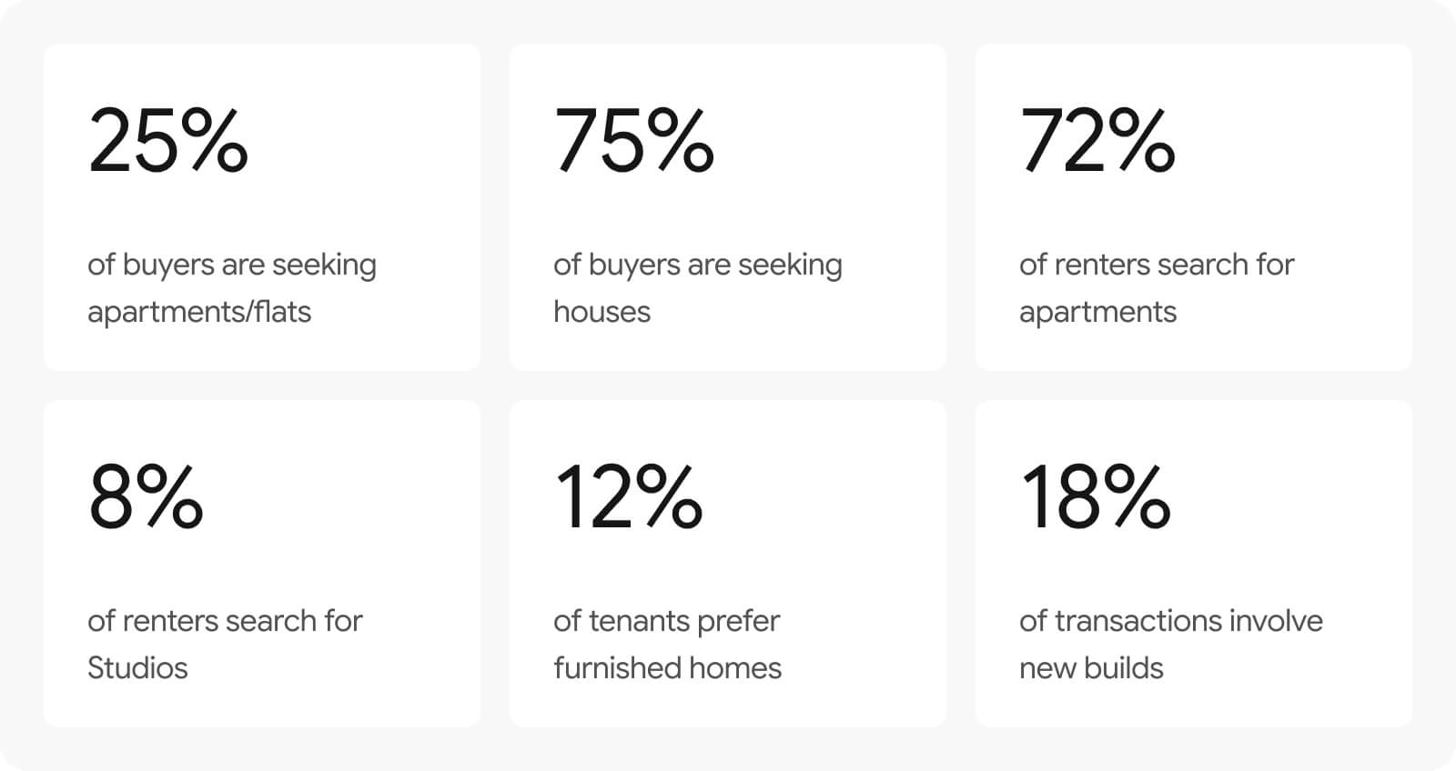
To better understand the UK real estate market, we studied the market trends and trajectories. Here are some of the key findings.

How might we turn stressful financial decisions into a guided experience where users feel they have a trusted guide by their side?
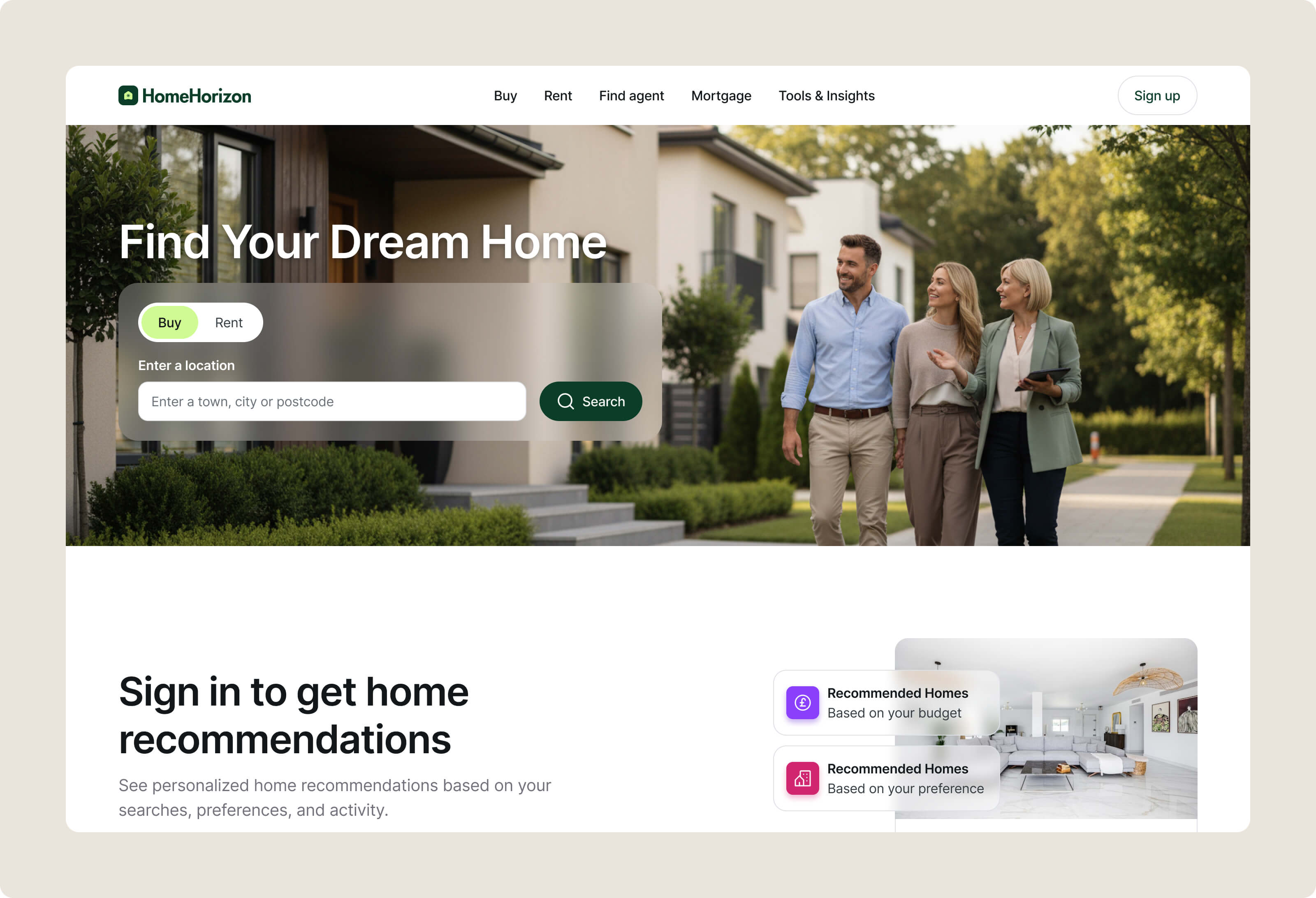
I kept the homepage clutter-free to reduce anxiety right from the start. By prioritizing a simple search bar, users feel confident starting their journey without getting overwhelmed by choices.
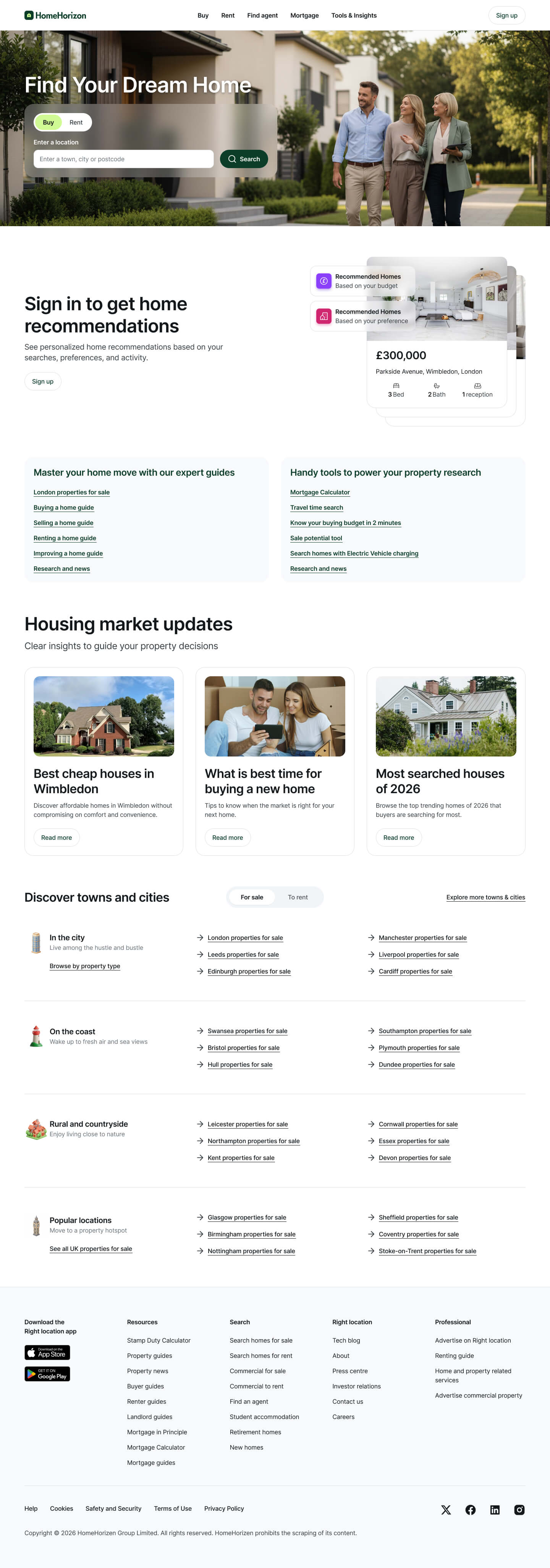
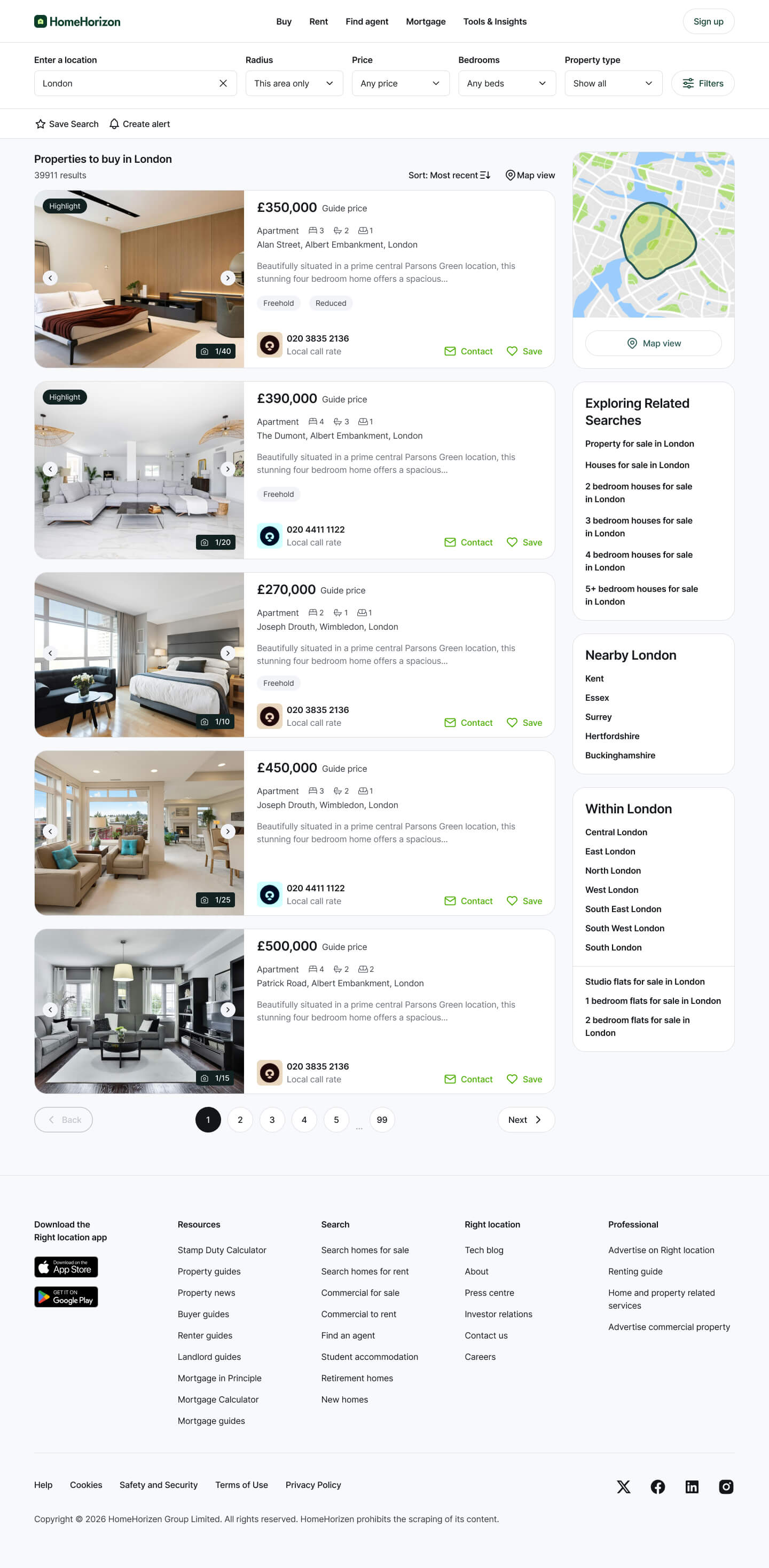
Users often get lost in too many listings, so I focused on clarity. Useful filters, clean listing cards, and quick insights help them narrow down options without feeling overloaded.
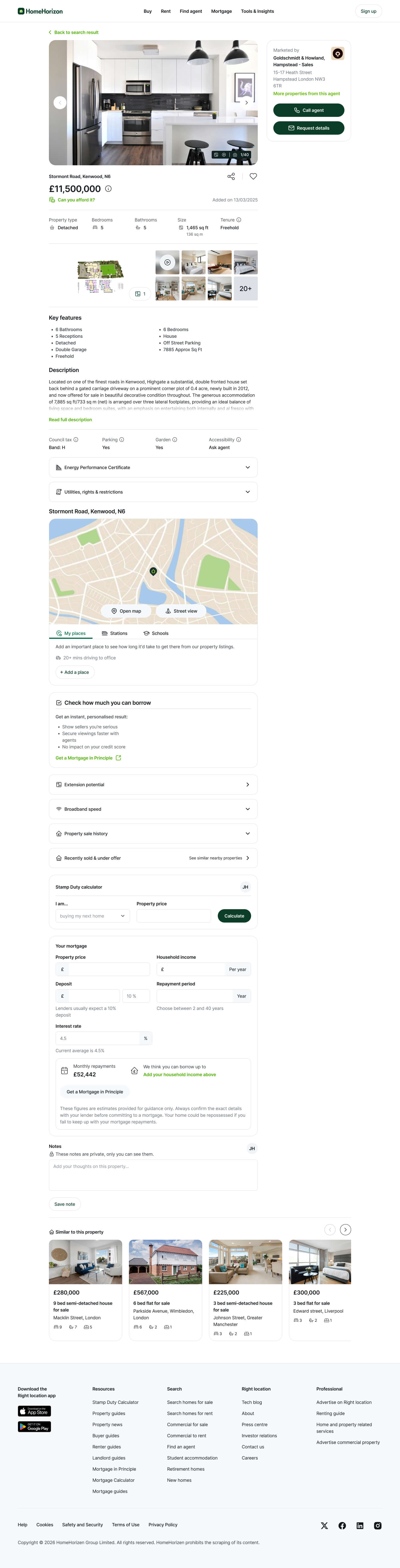
People need confidence before taking action. I designed this page to highlight key information, visuals, and clear CTAs so users can evaluate a property quickly and feel ready to inquire.
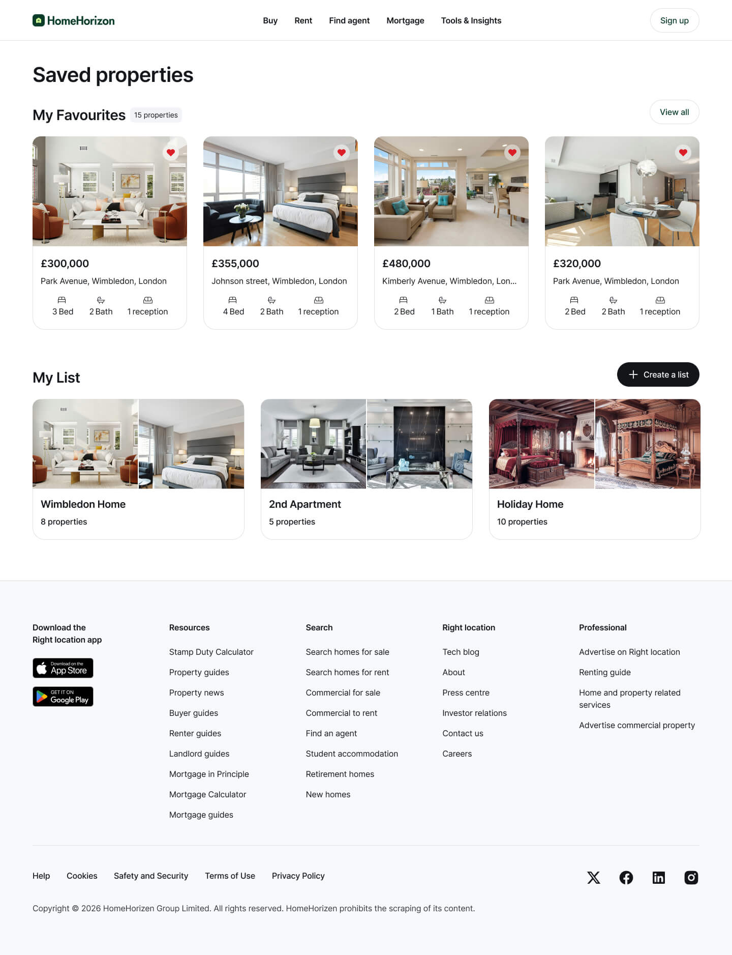
Shortlisting properties can get messy over time. This page keeps everything organized with easy access to saved homes and search lists, so users can pick up right where they left off.
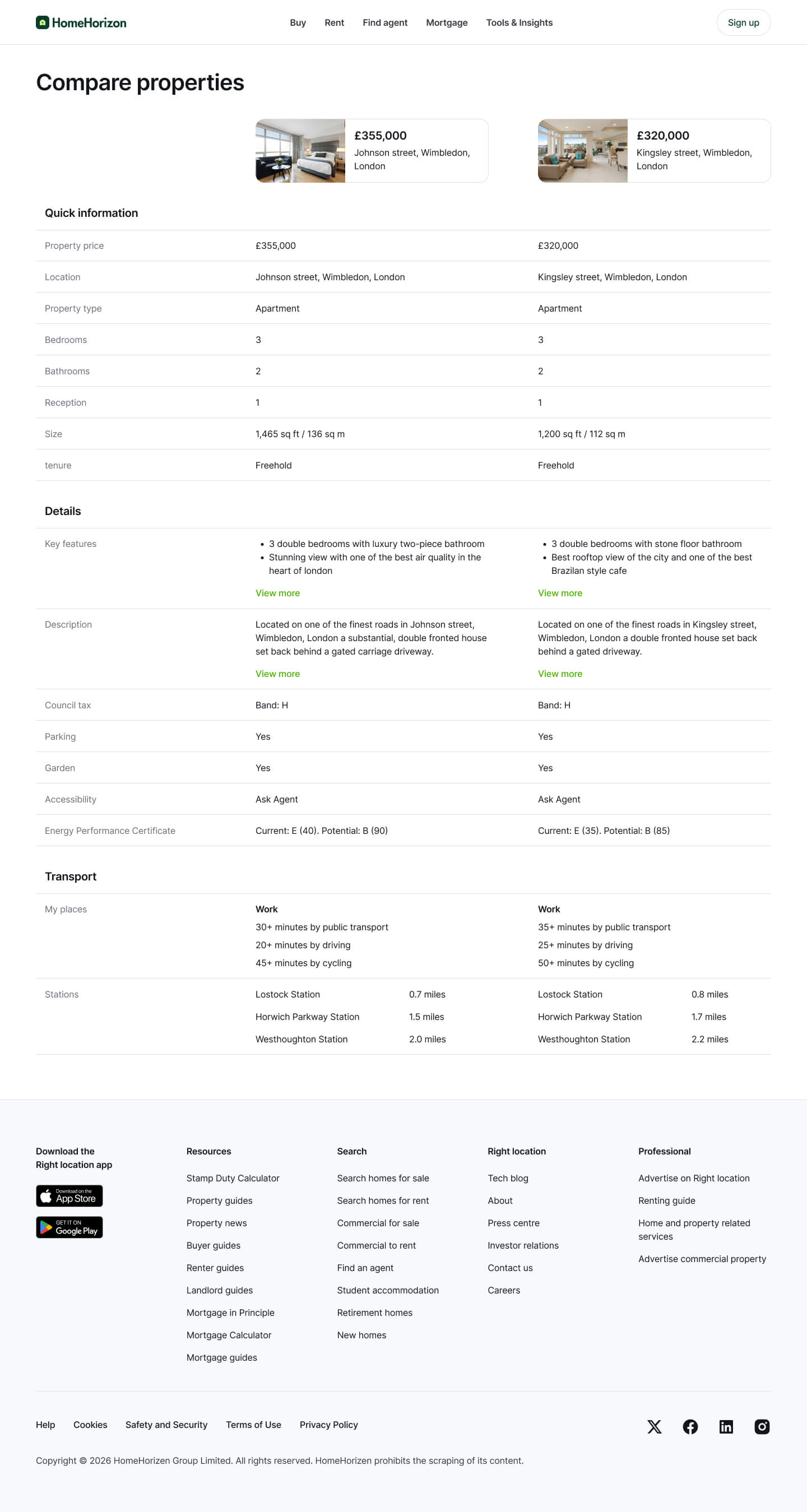
Comparing properties mentally is frustrating. I simplified that by putting key details side-by-side, helping users make faster, more confident decisions without switching back and forth.
By reducing friction in search and making results feel more relevant, users moved faster from 'just looking' to 'reaching out' agents. The streamlined experience not only increased user retention but directly empowered agents and developers to thrive in the competitive UK market.
of users found the end-to-end journey helpful and timesaving
estimated faster average time to discover and shortlist properties
estimated increase in returning users through saved searches and alerts
estimated drop-off in the from search to listing user journey
Designing for real estate isn’t just about showing properties, it’s about supporting decision-making under uncertainty. Small signals like relevance, trust, and timing matter more than flashy features.
I also learned that high-intent actions don’t come from pushing users, but from removing enough friction that acting feels like the natural next step.
 Let's talk
