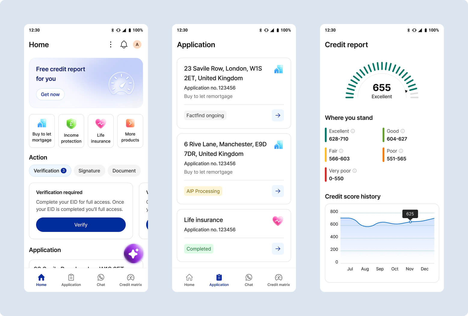
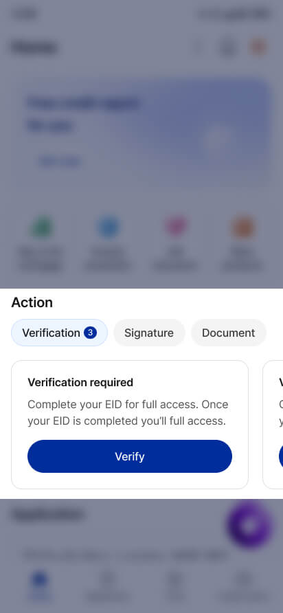
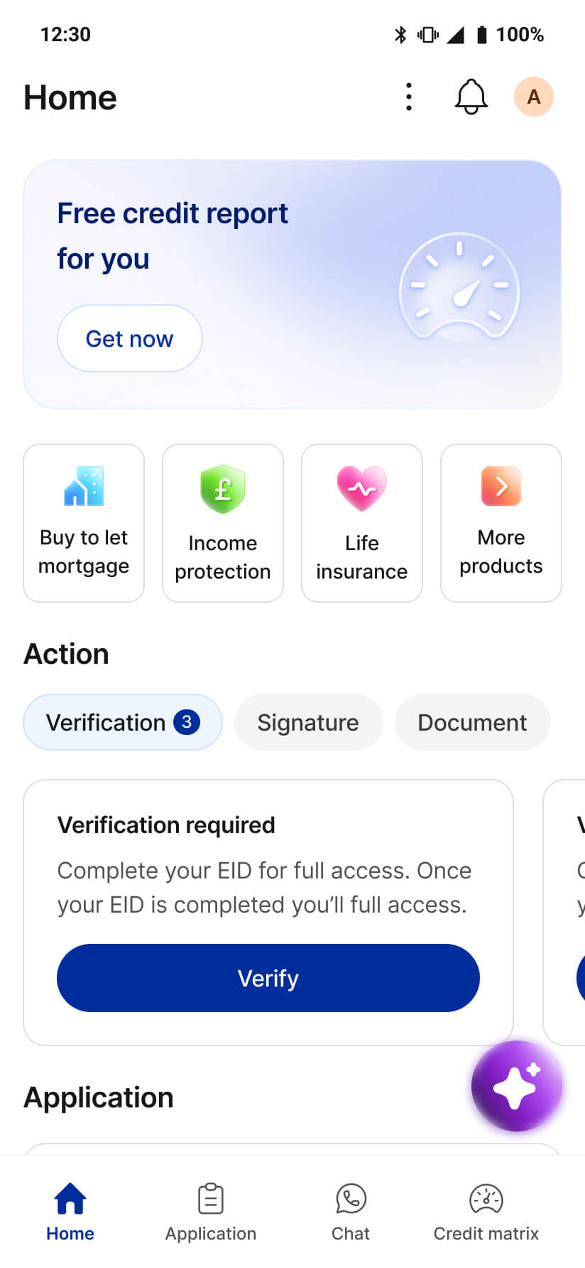
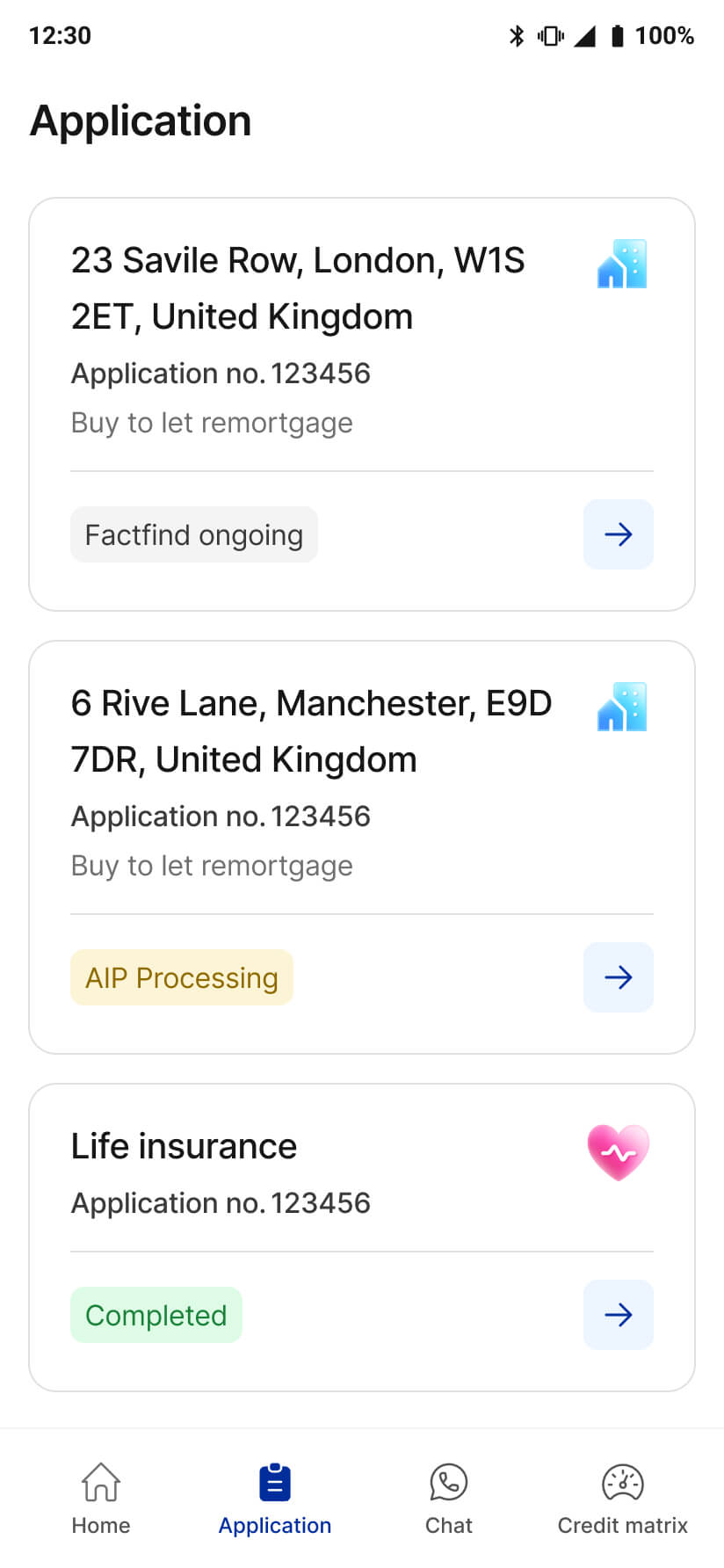
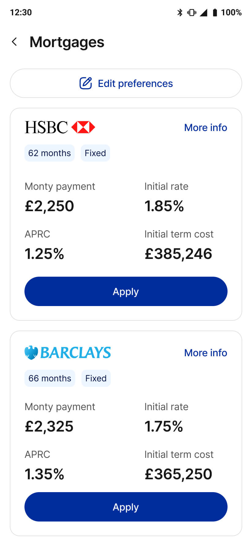
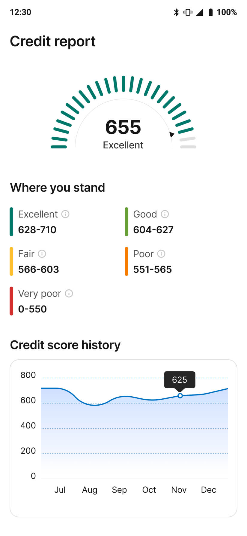
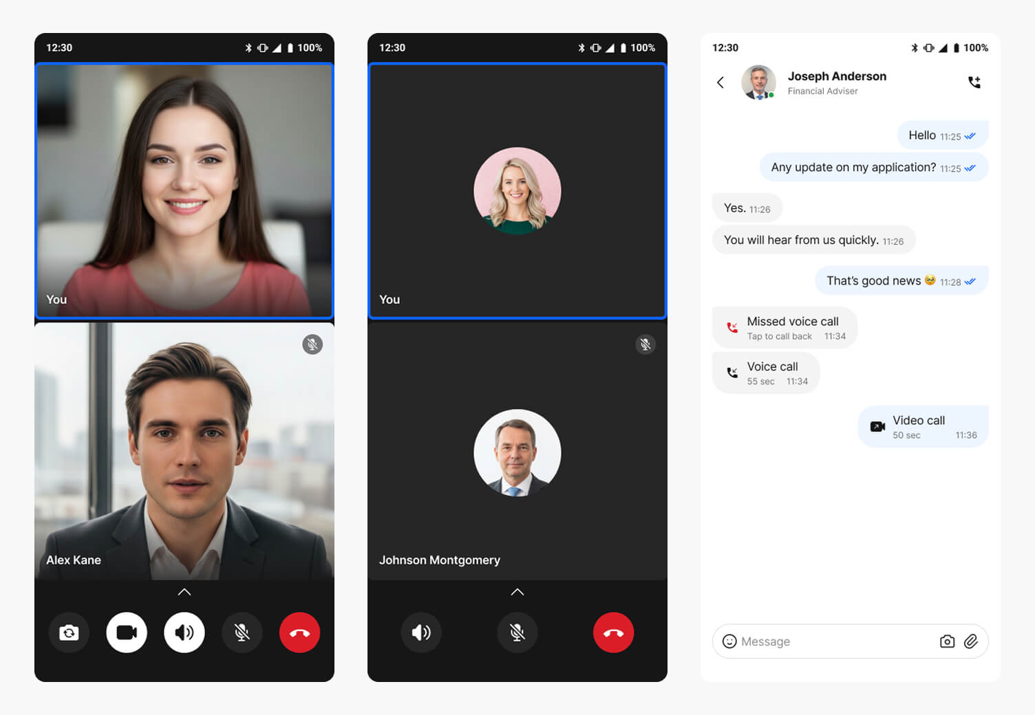
Due to NDA restrictions, the product name has been anonymized, and confidential research data & metrics have been abstracted, while the process and outcomes reflect my actual work.
Nestwise is a UK-based mobile app designed to be a one-stop solution for financial needs. It offers mortgages, insurance, loans, credit scores, eID verification, digital signatures, AI assistance, and in-person advisor support via text, audio, and video calls.
I was responsible for turning the ambitious vision into a user-friendly, scalable, market-ready product. I collaborated closely with the product and engineering team to create a modular product that could scale with the business.
Senior UI/UX Designer
End-to-End UX & UI Design Process
02 UI/UX Designer,
01 Product Manager,
05 Engineers
4 months
To better understand the challenges and user pain points, we conducted user interviews. Here are some of the key findings.
Users constantly switch between multiple apps, it causes stress and cognitive overload.
While choosing mortgages, loans, or insurance, users feel overwhelmed, vulnerable, and unsure.
FAQs and slow responses leave users feeling abandoned during critical moments.
Terms like LTV and underwriting are confusing for use, often and leads to misunderstanding.
Users worry about hidden fees and unclear pricing, fearing surprise charges and not getting the best deal.
Long forms and dense legal copy cause drop‑offs; users need clear steps and progressive disclosure.
We studied our competitors deeply to identify their strengths and weaknesses. Here are some of the key findings.
Most traditional banking apps are difficult to use and feel like data‑entry machines.
Modern financial apps feel more intuitive, and gamified for task completion.
For user support, chatbots and AI assistance are very common among apps.
Currently, not a single app in the UK offers an all in one financial solution.
We prioritized the must have and should have features first to tackle the core user journeys that create the most friction. This approach lets us validate assumptions quickly and keep scope focused for rapid iteration.
How might we turn stressful financial decisions into a guided experience where users feel they have a trusted guide by their side?
During early user testing and stakeholder review, several major and minor issues were identified. Below is a snippet showing the pending task design changes.
When users start their applications, advisers send them requests to verify their identity, provide a signature, and upload documents. During testing, users struggled to understand what actions to take.
The new design drastically improves the user experience. Users quickly understood what advisers were asking because the verification, signature, and document sections are now separated into tabs.
The dashboard prioritizes user needs and helps users find information easily when they are communicating with an adviser.
Users visit the application screen after applying for a product. Here, finding the correct application and checking the status is prioritized.
The product screen shows all the necessary product information a user needs before applying for a mortgage, loan, or insurance.
The credit score is a critical factor in financial decision-making. Users not only need visibility into their score but also tools to monitor it.
Seamless adviser chat is a key differentiator for the app, so the text, voice, and video chat interfaces are designed to prioritize clear, effortless communication.
The AI assistant is available whenever users encounter an issue, providing instant support across text, voice, and multimedia channels.
eID verification is required to access products. The screens offer clear, step‑by‑step guidance to ensure a seamless verification experience.
We unified a fragmented financial journey into one intuitive, mobile-first experience. Here is the data showing how these design improvements created a better experience for both our users and the business.
automated verification success rate for eID verification
reduction in processing time processing time with the end-to-end journey
increase in completed applications achieved by the guided application flow
reduction in support dependency with the AI assistant support
Working on Finance Magic made me realize that the real challenge isn’t adding more features, it’s making them feel simple. When everything from mortgages to insurance lives in one place, the experience has to guide people gently, otherwise it gets overwhelming very quickly.
I also saw how important the human side is, even in a product with AI. Giving people the option to talk to a real advisor adds a level of reassurance that automation just can’t fully replace.
This project changed how I think about design. I had to stop looking at individual flows in isolation and start thinking about how everything connects. With so many features in one place, the real work was >making sure the whole experience felt consistent, clear, and easy to move through.