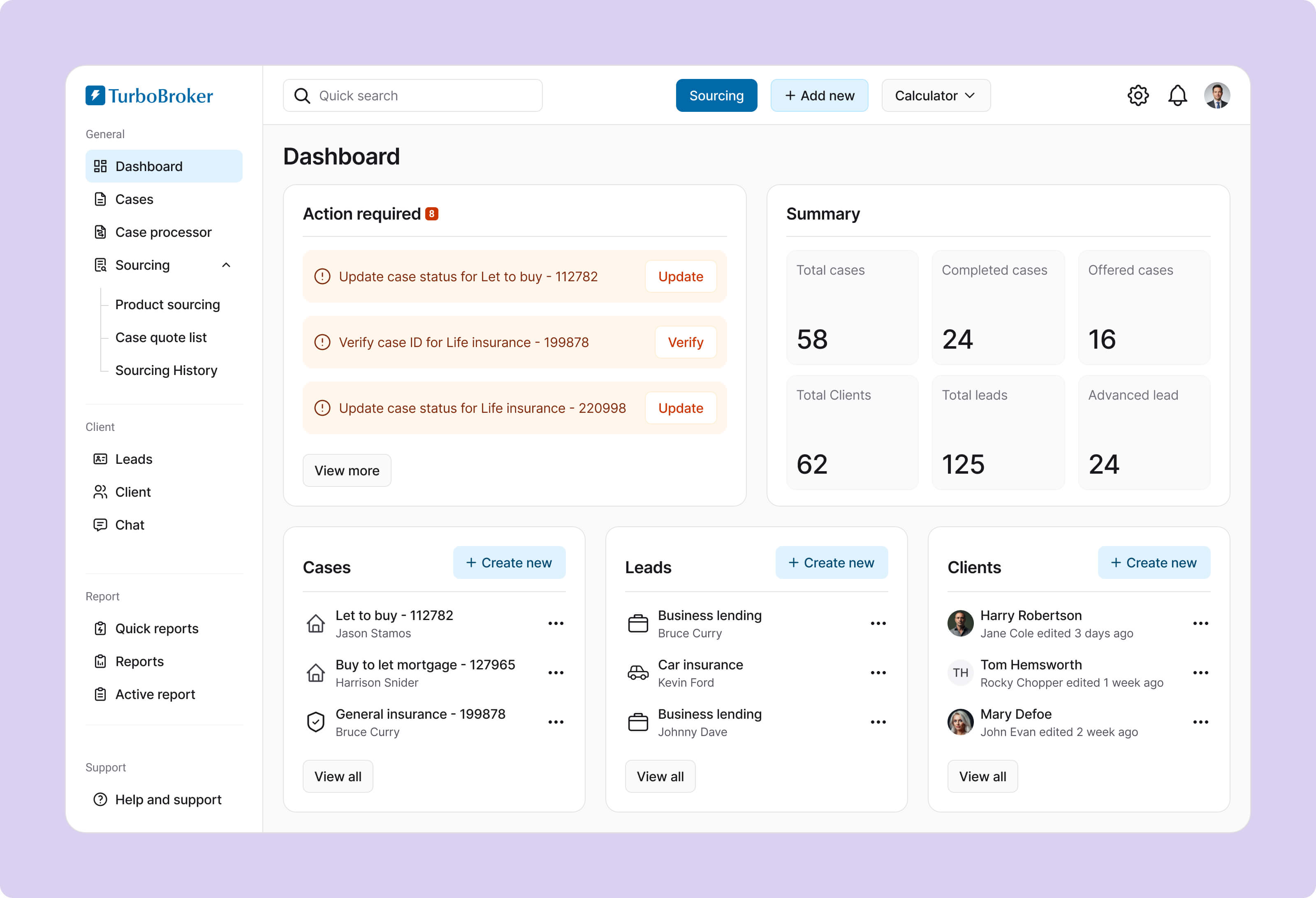
Minimizing errors and delays for mortgage brokers

Nestwise Case Study
Lock icon

Due to NDA restrictions, the product name has been anonymized, and confidential research data & metrics have been abstracted, while the process and outcomes reflect my actual work.

Overview

TurboBroker is a UK-based Mortgage CRM platform built specifically for small and medium-sized mortgage brokerage and intermediaries. It helps brokers manage mortgage applications, track client information, and navigate complex compliance requirements in one place. However, the existing system had grown outdated and difficult to navigate.

Without a senior UX designer on the project, I collaborate closely with the project manager to identify usability issues, redefine key workflows, and introduce a clearer, more efficient interface.

Role

Senior UI/UX Designer

Responsibilities

End-to-End UX & UI Design Process

Collaborators

01 Product Manager,

03 Engineers

Timeline

4 months

Research

Understanding the user

Before redesigning TurboBroker, it was important to understand who actually uses the platform every day. Through my research, three primary user groups emerged.

Mortgage Broker

Mortgage Brokers (Primary Users)

Mortgage brokers are the main users of the platform. They manage the entire mortgage journey. From the first client conversation to submitting applications and completing deals.

Goals

Brokers want to capture client information quickly, track multiple applications, compare lenders efficiently, and submit applications without delays.

Frustrations

Many brokers struggle with slow workflows, excessive data entry, and difficulty tracking case progress across different screens.

Mortgage Broker

Case Managers / Administrators

Case managers handle documentation, updating case statuses, and coordinating communication with lenders and clients. They play a key role in making sure applications progress smoothly.

Goals

Their goal is to keep cases organized, track required documents, and ensure applications move through each stage without delays.

Frustrations

Case managers often deal with scattered information, unclear case timelines, and constant manual follow-ups for missing documents.

Mortgage Broker

Brokerage Owners / Managers

Managers and brokerage owners use the platform to monitor operations, performance, and compliance across their teams.

Goals

They want clear visibility into deal pipelines, broker performance, and overall business activity so they can make better operational decisions and ensure regulatory compliance.

Frustrations

Managers often struggle with limited reporting, fragmented data, and difficulty understanding team performance quickly.

Discovering the problems with the current Design

Before we start the new design, it’s important to study the old design to understand why users are having trouble using it.

High Cognitive Load

The previous design suffered from a system‑wide issue: it displayed everything at once, creating a high cognitive load and overwhelming users.

Error-prone system

forms were long, dense, and poorly structured. It made those difficult to complete accurately, causing frequent data entry mistakes.

Frequent delays

Important tools were buried inside menus or unclear labels. Users often relied on trial-and-error navigation, which slowed down daily workflows drastically.

Lack of Visual Hierarchy

As visual hierarchy was not maintained, critical alerts, such as expiring offers or missing documents, were styled the same as routine notifications.

Lack of design consistency

The old design has no consistency in UI elements. The lack of patterns made the interface harder to learn.

How might we...

How might we redesign a mortgage CRM platform that minimize broker errors and drastically reduces application processing times?

UI Design

Dashboard

I removed the visual clutter that used to make the screen feel heavy and inconsistent. Key information is highlighted clearly so brokers can scan their day in seconds and Common tasks are now one click away.

dviser Support

Cases

I redesigned the cases page with clear status indicators and robust search filters. This cuts down the time spent hunting for specific files and allows brokers to instantly jump into critical case details without losing their flow.

dviser Support

Sourcing

In the old design finding the right product felt slow and overwhelming. The new design makes filtering and comparing products feel effortless, helping brokers confidently choose the best option for their clients.

dviser Support

Clients

Client information was scattered and hard to piece together. I brought everything into one place without adding visual noise. Now, brokers can get a clear view of each client, access the necessary information, and take action easily.

dviser Support

Users

Managers lacked visibility into team performance and workload. This redesign gives them a simple, structured overview of users, making it easier to monitor activity and support their team effectively.

dviser Support
Impact

The project outcome

The redesign wasn’t only about making things look better. It made the whole system simpler to follow and much less likely to cause mistakes. Brokers can now work faster, feel more confident, and face fewer interruptions that slow them down.

100+

small and medium-sized mortgage brokerages are using it everyday

-25%

reduction in onboarding training sessions for new brokers

+20%

increase in task completion rate on first attempt during case processing

-33%

reduction in application processing time, resulting in processing more applications.

Learnings

What I learned from this project

This project taught me how quickly cognitive load adds up in complex systems. What felt like small friction points in isolation turned into a frustrating experience when combined. Simplifying flows, reducing unnecessary decisions, and guiding users step by step made a bigger difference than any visual polish. I realized that a ‘clean’ design isn't just about white space; it is about organizing complex requirements so they feel manageable rather than overwhelming.

I also learned the importance of designing for error prevention, not just error handling. Helping users avoid mistakes in the first place had a direct impact on both efficiency and confidence.

It pushed me to collaborate more closely with stakeholders who think in terms of compliance, risk, and business constraints. Balancing those needs with user experience was challenging but rewarding.

Do you have any questions?

Reach out anytime!

Get in touch Get in touch Let's talk
VIEW CASE STUDY